CodingIndo
Dibuat Oleh Devis Wisley
Dibuat Oleh Devis Wisley
Sunday, September 01, 2024
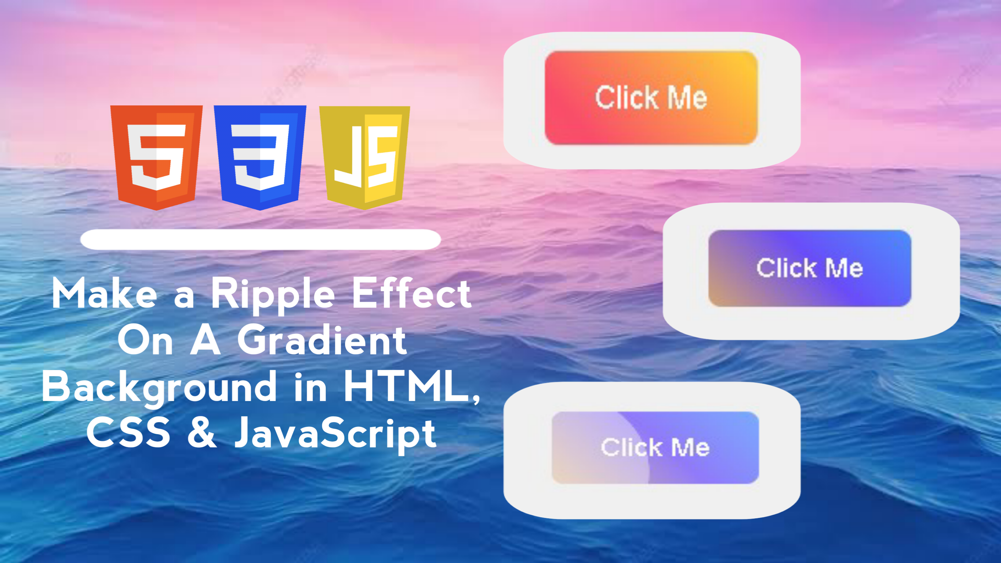
Create an interactive Button with a Ripple Effect when clicked, which has a dynamic color gradient background. The ripple effect provides interesting visual feedback to users when they interact with the button.
In this blog post, I will walk you through creating an interactive button with an attractive ripple effect and gradient background using HTML, CSS, and JavaScript. We will create a button with a dynamic gradient background that will create a ripple effect when clicked.
With these features, the ripple button project with gradient background can give a professional touch to your user interface!
By creating a ripple effect project on a button with a gradient background using HTML, CSS, and JavaScript, you will gain the following skills:
This project will not only improve your technical skills in web development, but also give you a better understanding of how to combine HTML, CSS, and JavaScript to create professional and aesthetic user interface elements.
Here are the steps to create a ripple effect on a button with a gradient background using HTML, CSS, and JavaScript:
<!DOCTYPE html>
<!-- Coding By CodingIndo - https://codingindo.vercel.app/ -->
<html lang="en">
<head>
    <!-- Meta charset to define character encoding -->
    <meta charset="UTF-8">
    <!-- Meta viewport to set responsive display -->
    <meta name="viewport" content="width=device-width, initial-scale=1.0">
    <!-- Title for page title -->
    <title>Button Ripple Effect</title>
    <!-- Stylesheet link to link CSS files -->
    <link rel="stylesheet" href="styles.css">
</head>
<body>
    <!-- Container for ripple effect button -->
    <div class="button-container">
        <!-- Button with ripple effect -->
        <button class="ripple-button">Click Me</button>
    </div>
    <!-- Script to link JavaScript files -->
    <script src="script.js"></script>
</body>
</html>
| Number | Line of Code | Explanation |
|---|
/* Sets the body display to be centered and have a background color */
body {
    display: flex;
    justify-content: center;
    align-items: center;
    height: 100vh;
    margin: 0;
    background-color: #f0f0f0;
}

/* Sets the relative position for the button container */
.button-container {
    position: relative;
}

/* Set the appearance of the ripple button */
.ripple-button {
    position: relative;
    overflow: hidden;
    background: linear-gradient(45deg, #ff6b6b, #f94d6a, #ffca3a, #6a4df9, #3ab7ff);
    background-size: 300% 300%;
    border: none;
    border-radius: 8px;
    padding: 15px 30px;
    color: white;
    font-size: 18px;
    cursor: pointer;
    outline: none;
    transition: background-position 1s;
}

/* Sets the hover effect on the ripple button */
.ripple-button:hover {
    background-position: right center;
}

/* Sets the after effect on the ripple button */
.ripple-button::after {
    content: '';
    position: absolute;
    border-radius: 50%;
    width: 100px;
    height: 100px;
    background-color: rgba(255, 255, 255, 0.6);
    opacity: 0;
    transform: scale(1);
    transition: transform 0.5s, opacity 1s;
}

/* Sets the ripple span display on the button */
.ripple-button span.ripple {
    position: absolute;
    border-radius: 50%;
    background-color: rgba(255, 255, 255, 0.5);
    transform: scale(0);
    animation: ripple-animation 0.6s linear;
    pointer-events: none;
}

/* Set the ripple animation */
@keyframes ripple-animation {
    to {
        transform: scale(4);
        opacity: 0;
    }
}
| Number | Line of Code | Explanation |
|---|
// Add an event listener for clicks on elements with class 'ripple-button'
document.querySelector('.ripple-button').addEventListener('click', function (e) {
    // Create a new 'span' element for the ripple effect
    const ripple = document.createElement('span');
    // Get the clicked button element
    const button = e.currentTarget;
    // Get the size and position of the button
    const rect = button.getBoundingClientRect();
    // Calculate ripple size based on button size
    const size = Math.max(rect.width, rect.height);
    // Calculate the x position of the ripple
    const x = e.clientX - rect.left - size / 2;
    // Calculate the y position of the ripple
    const y = e.clientY - rect.top - size / 2;
    // Set the ripple size
    ripple.style.width = ripple.style.height = `${size}px`;
    // Set the left position of the ripple
    ripple.style.left = `${x}px`;
    // Set the top position of the ripple
    ripple.style.top = `${y}px`;
    // Add 'ripple' class to span element
    ripple.classList.add('ripple');
    // Add ripple element to the button
    button.appendChild(ripple);
    // Remove the ripple element after the animation is complete
    ripple.addEventListener('animationend', () => {
        ripple.remove();
    });
});
| Number | Line of Code | Explanation |
|---|
By keeping these additional notes in mind, you can ensure that the ripple effect on your buttons is not only visually appealing but also optimal for user experience.
In this tutorial, we have learned how to create a button with an attractive ripple effect and gradient background using HTML, CSS, and JavaScript. By following the steps outlined, you can enhance the user experience on your app or website by providing dynamic visual feedback.

Devis Wisley atau yang dikenal sebagai DevCode merupakan seorang Founder & Developer CodingIndo, sebuah komunitas dan platform edukasi teknologi yang berfokus pada pengembangan keterampilan pemrograman. Dengan passion-nya di dunia coding, DevCode berkomitmen untuk membantu para developer lokal meningkatkan kemampuan teknis melalui konten edukatif, tutorial, dan kolaborasi open-source.
Dibawah kepemimpinannya, CodingIndo terus berkembang menjadi wadah bagi programmer pemula maupun profesional untuk saling berbagi ilmu, mengikuti tren teknologi terbaru, dan membangun jaringan di industri IT. Selain aktif mengembangkan proyek-proyek inovatif, DevCode juga sering membagikan insight seputar pengembangan software, tips karir tech, serta best practices dalam dunia pemrograman.
Thursday, October 17, 2024
Sunday, September 01, 2024
Saturday, August 31, 2024
Sunday, September 08, 2024
LEAVE A REPLY