Responsive calculator using Bootstrap, TailwindCSS & JavaScript
Tuesday, August 13, 2024

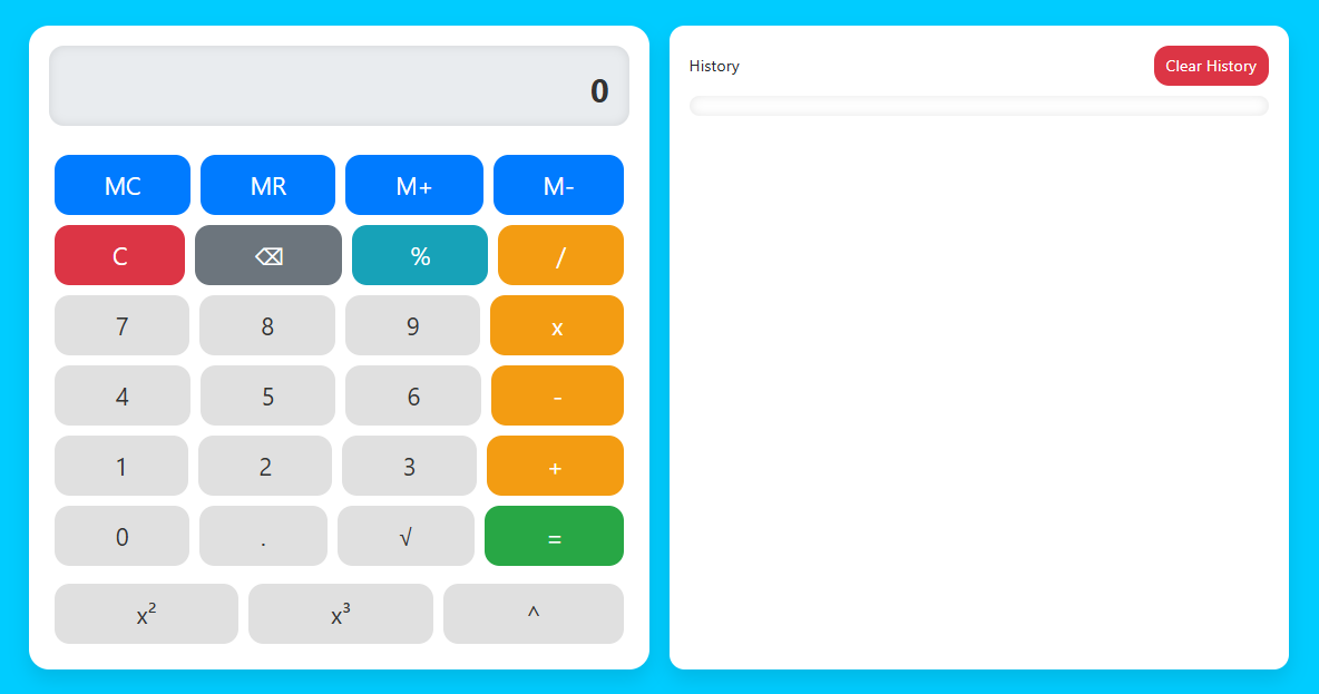
This Responsive Calculator is a calculator web application designed to provide an optimal user experience across devices, from desktops to smartphones. Using modern technologies like Bootstrap and TailwindCSS, as well as JavaScript for interactive logic, this calculator offers a clean, functional and responsive interface.
In this blog post, I’ll walk you through creating a modern and functional responsive calculator using HTML, CSS, and JavaScript. We’ll replicate the calculator’s key features, including its clean and intuitive design, by leveraging:
- Bootstrap: for responsive grid system and ready-to-use UI elements.
- TailwindCSS: for additional styling and design adjustments to make it look more attractive.
- JavaScript: to handle the calculator logic, including mathematical calculations and user interactions.
As you work on this project, you’ll learn how to structure and style websites effectively to ensure they look great on all devices.
Key Features:
- Responsive Design: Using Bootstrap and TailwindCSS to ensure the calculator displays and functions well on a variety of screen sizes, from mobile to desktop.
- Display Bar: Displays the calculation results in large and clear font sizes, making them easy to read.
- Calculator Buttons:
- Number Keys: Keys for numbers 0-9, including decimal key, to enter numbers.
- Operator Keys: Keys for basic mathematical operations such as addition (+), subtraction (-), multiplication (*), division (/), as well as additional operations such as percentage (%) and exponent (^).
- Functional Keys: Keys to clear input (C), delete the last character (⌫), and calculate results (=).
- Memory Function:
- MC (Memory Clear): Clears the values stored in the calculator's memory.
- MR (Memory Recall): Retrieves a value stored in the calculator's memory.
- M+ (Memory Add): Adds the current display value to memory.
- M- (Memory Subtract): Subtracts the current display value from memory.
- Additional Functions:
- Square Root (√): Calculates the square root of the displayed value.
- Power (x², x³, ^): Calculates the square, cube, or other power of a displayed value.
- Calculation History: Saves and displays calculation history for user reference.
- Clean and Modern Layout: Uses a minimalist design with organized and easily accessible elements for an optimal user experience.
With these features, your currency converter will have complete functionality and an attractive design, making it not only useful but also enjoyable to use.
Why Responsive calculator using HTML, Bootstrap, CSS & JavaScript?
- HTML: You will learn how to leverage Bootstrap's grid system and UI components to create responsive and engaging layouts. This includes using Bootstrap's grid classes and utilities to ensure the calculator works well across a variety of screen sizes.
- Bootstrap: You will hone your skills in using TailwindCSS to customize and enhance the appearance of the calculator. This includes implementing Tailwind utilities for padding, margins, colors, and hover effects to create a clean and modern design.
- JavaScript: You will develop skills in using JavaScript to handle the logic of a calculator application. This includes handling user input, mathematical calculations, and DOM manipulation to dynamically update the calculator display.
- Integrating CSS Frameworks with JavaScript: You will learn how to integrate CSS frameworks like Bootstrap and Tailwind with JavaScript to create web applications that are not only functional but also aesthetic.
- Responsive Testing and Customization: You will understand how to test and customize so that the calculator displays and functions well across a variety of devices, ensuring a consistent and enjoyable user experience.
By building this responsive calculator project using Bootstrap, TailwindCSS, and JavaScript, you can gain the following skills:
This project will provide a solid foundation in responsive web design and front-end development, paving the way for more complex web projects in the future. Good luck and may the skills you gain be useful in developing future projects!
Steps to responsive calculator using Bootstrap, TailwindCSS & JavaScript
- Create Project Folder: Create a new folder for the calculator project.
- Inside Project Folder:
- index.html The main HTML file.
- script.js JavaScript for calculator logic.
Here are the steps to create a responsive calculator using Bootstrap, TailwindCSS, and JavaScript. We will break this process down into several parts:
1. Project Setup
Create Folder Structure
2. HTML Structure for Calculator
Add the following HTML inside the <body> tag to create the calculator. We are using Bootstrap’s grid layout to arrange the calculator buttons and Tailwind CSS for additional styling.
<!DOCTYPE html>
<!-- Coding By CodingIndo - https://codingindo.vercel.app/ -->
<html lang="en">
<head>
    <!-- Meta tag for character encoding -->
    <meta charset="UTF-8">
    <!-- Meta tag for setting the viewport to be responsive on mobile devices -->
    <meta name="viewport" content="width=device-width, initial-scale=1.0">
    <!-- Page title -->
    <title>Calculator</title>
    <!-- Connecting Bootstrap CSS -->
    <link href="https://cdn.jsdelivr.net/npm/bootstrap@5.3.0/dist/css/bootstrap.min.css" rel="stylesheet">
    <!-- Connecting TailwindCSS -->
    <script src="https://cdn.tailwindcss.com"></script>
    <style>
        /* Sets the body background color */
        body {
            background-color: #00c7f9;
        }

        /* Set the main container */
        .container {
            max-width: 1200px;
            margin: 50px auto;
            display: flex;
            flex-wrap: wrap;
            gap: 20px;
        }

        /* Set the calculator display */
        .calculator {
            background: #ffffff;
            border-radius: 20px;
            padding: 20px;
            box-shadow: 0px 10px 20px rgba(0, 0, 0, 0.1);
            flex: 1;
            min-width: 300px;
        }

        /* Set the calculator screen display */
        .display {
            height: 80px;
            background: #e9ecef;
            text-align: right;
            padding: 20px;
            font-size: 32px;
            font-weight: bold;
            border-radius: 15px;
            box-shadow: inset 0 0 10px rgba(0, 0, 0, 0.1);
            color: #333;
        }

        /* Set the appearance of the calculator buttons */
        .btn-custom {
            height: 60px;
            font-size: 24px;
            border-radius: 15px;
            margin: 5px;
            transition: background-color 0.3s ease, transform 0.2s ease;
        }

        /* Effect when button is pressed */
        .btn-custom:active {
            transform: scale(0.95);
        }

        /* Set the appearance of the number keys */
        .btn-number {
            background-color: #e0e0e0;
            color: #333;
        }

        /* Hover effect on number keys */
        .btn-number:hover {
            background-color: #c0c0c0;
        }

        /* Set the display of operator buttons */
        .btn-operator {
            background-color: #f39c12;
            color: #fff;
        }

        /* Hover effect on operator buttons */
        .btn-operator:hover {
            background-color: #e67e22;
        }

        /* Sets the button appearance to be the same as */
        .btn-equal {
            background-color: #28a745;
            color: #fff;
        }

        /* Hover effect on button is same as */
        .btn-equal:hover {
            background-color: #218838;
        }

        /* Set the appearance of the clear button */
        .btn-clear {
            background-color: #dc3545;
            color: #fff;
        }

        /* Hover effect on clear button */
        .btn-clear:hover {
            background-color: #c82333;
        }

        /* Set the memory button display */
        .btn-memory {
            background-color: #007bff;
            color: #fff;
        }

        /* Hover effect on memory button */
        .btn-memory:hover {
            background-color: #0069d9;
        }

        /* Set the appearance of the delete button */
        .btn-delete {
            background-color: #6c757d;
            color: #fff;
        }

        /* Hover effect on delete button */
        .btn-delete:hover {
            background-color: #5a6268;
        }

        /* Sets the appearance of the percent button */
        .btn-percentage {
            background-color: #17a2b8;
            color: #fff;
        }

        /* Hover effect on percent button */
        .btn-percentage:hover {
            background-color: #138496;
        }

        /* Set the container history display */
        .history-container {
            background: #ffffff;
            border-radius: 15px;
            padding: 20px;
            box-shadow: 0px 10px 20px rgba(0, 0, 0, 0.1);
            flex: 1;
            max-width: 100%;
            min-width: 300px;
        }

        /* Set history display */
        .history {
            max-height: 300px;
            overflow-y: auto;
            background: #ffffff;
            border-radius: 15px;
            padding: 10px;
            font-size: 14px;
            box-shadow: inset 0 0 10px rgba(0, 0, 0, 0.1);
            color: #333;
            margin-top: 10px;
        }

        /* Set the display of history items */
        .history-item {
            margin-bottom: 5px;
        }

        /* Set the appearance of the clear history button */
        .btn-clear-history {
            background-color: #dc3545;
            color: #fff;
            border-radius: 15px;
            height: 40px;
            font-size: 16px;
            transition: background-color 0.3s ease;
            border: none;
        }

        /* Hover effect on clear history button */
        .btn-clear-history:hover {
            background-color: #c82333;
        }

        /* Set responsive display for small screens */
        @media (max-width: 768px) {
            .container {
                flex-direction: column;
            }
        }
    </style>
</head>
<body>
    <div class="container">
        <div class="calculator">
            <!-- Calculator screen -->
            <div id="display" class="display mb-4">0</div>
            <!-- Memory button -->
            <div class="d-flex flex-wrap">
                <button class="btn btn-custom btn-memory flex-grow-1" onclick="memoryClear()">MC</button>
                <button class="btn btn-custom btn-memory flex-grow-1" onclick="memoryRecall()">MR</button>
                <button class="btn btn-custom btn-memory flex-grow-1" onclick="memoryAdd()">M+</button>
                <button class="btn btn-custom btn-memory flex-grow-1" onclick="memorySubtract()">M-</button>
            </div>
            <!-- Clear, delete, percent, and divide buttons -->
            <div class="d-flex flex-wrap">
                <button class="btn btn-custom btn-clear flex-grow-1" onclick="clearDisplay()">C</button>
                <button class="btn btn-custom btn-delete flex-grow-1" onclick="deleteLast()">⌫</button>
                <button class="btn btn-custom btn-percentage flex-grow-1" onclick="appendOperator('%')">%</button>
                <button class="btn btn-custom btn-operator flex-grow-1" onclick="appendOperator('/')">/</button>
            </div>
            <!-- Number keys 7, 8, 9, and times -->
            <div class="d-flex flex-wrap">
                <button class="btn btn-custom btn-number flex-grow-1" onclick="appendNumber('7')">7</button>
                <button class="btn btn-custom btn-number flex-grow-1" onclick="appendNumber('8')">8</button>
                <button class="btn btn-custom btn-number flex-grow-1" onclick="appendNumber('9')">9</button>
                <button class="btn btn-custom btn-operator flex-grow-1" onclick="appendOperator('*')">x</button>
            </div>
            <!-- Number keys 4, 5, 6, and less -->
            <div class="d-flex flex-wrap">
                <button class="btn btn-custom btn-number flex-grow-1" onclick="appendNumber('4')">4</button>
                <button class="btn btn-custom btn-number flex-grow-1" onclick="appendNumber('5')">5</button>
                <button class="btn btn-custom btn-number flex-grow-1" onclick="appendNumber('6')">6</button>
                <button class="btn btn-custom btn-operator flex-grow-1" onclick="appendOperator('-')">-</button>
            </div>
            <!-- Number keys 1, 2, 3, and plus -->
            <div class="d-flex flex-wrap">
                <button class="btn btn-custom btn-number flex-grow-1" onclick="appendNumber('1')">1</button>
                <button class="btn btn-custom btn-number flex-grow-1" onclick="appendNumber('2')">2</button>
                <button class="btn btn-custom btn-number flex-grow-1" onclick="appendNumber('3')">3</button>
                <button class="btn btn-custom btn-operator flex-grow-1" onclick="appendOperator('+')">+</button>
            </div>
            <!-- Number keys 0, period, root, and equals -->
            <div class="d-flex flex-wrap">
                <button class="btn btn-custom btn-number flex-grow-1" onclick="appendNumber('0')">0</button>
                <button class="btn btn-custom btn-number flex-grow-1" onclick="appendNumber('.')">.</button>
                <button class="btn btn-custom btn-number flex-grow-1" onclick="calculateSquareRoot()">√</button>
                <button class="btn btn-custom btn-equal flex-grow-1" onclick="calculateResult()">=</button>
            </div>
            <!-- Rank button 2, Rank button 3, and Rank n buttons -->
            <div class="d-flex flex-wrap mt-2">
                <button class="btn btn-custom btn-number flex-grow-1" onclick="appendOperator('**')">x²</button>
                <button class="btn btn-custom btn-number flex-grow-1" onclick="appendOperator('**3')">x³</button>
                <button class="btn btn-custom btn-number flex-grow-1" onclick="appendOperator('**')">^</button>
            </div>
        </div>
        <div class="history-container">
            <div class="d-flex justify-between align-items-center mb-2">
                <!-- Title history -->
                <h5>History</h5>
                <!-- Clear history button -->
                <button class="btn btn-clear-history" onclick="clearHistory()">Clear History</button>
            </div>
            <!-- Container to display history -->
            <div id="history" class="history"></div>
        </div>
    </div>
    <!-- Links a custom JavaScript file for this page -->
    <script src="script.js"></script>
</body>
</html>
Explanation
| Number | Line of Code | Explanation |
|---|
3. Add JavaScript to Calculator Function
Create a "script.js" to handle the calculator logic. This includes functions for displaying numbers, operators, and results, as well as functions for memory manipulation:
// Get display and history elements from DOM
let display = document.getElementById('display');
let history = document.getElementById('history');
let memory = 0; // Inisialisasi variabel memory
// Function to clear display contents
function clearDisplay() {
display.innerText = '0';
}
// Function to delete the last character on the display
function deleteLast() {
display.innerText = display.innerText.slice(0, -1) || '0';
}
// Function to add numbers to the display
function appendNumber(number) {
if (display.innerText === '0') {
display.innerText = number;
} else {
display.innerText += number;
}
}
// Function to add operators to the display
function appendOperator(operator) {
if (display.innerText !== '0') {
display.innerText += ` ${operator} `;
}
}
// Function to calculate the result of the expression on the display
function calculateResult() {
try {
let result = eval(display.innerText.replace('^', '**'));
display.innerText = result;
addToHistory(display.innerText); // Add results to history
} catch {
display.innerText = 'Error';
}
}
// Function to calculate the square root of the value in display
function calculateSquareRoot() {
try {
let result = Math.sqrt(eval(display.innerText));
display.innerText = result;
addToHistory(display.innerText); // Add results to history
} catch {
display.innerText = 'Error';
}
}
// Function to delete values in memory
function memoryClear() {
memory = 0;
}
// Function to display the value in memory to the display
function memoryRecall() {
display.innerText = memory;
}
// Function to add the value in the display to memory
function memoryAdd() {
memory += parseFloat(display.innerText) || 0;
}
// Function to subtract the value on display from memory
function memorySubtract() {
memory -= parseFloat(display.innerText) || 0;
}
// Function to add an entry to history
function addToHistory(entry) {
const historyItem = document.createElement('div');
historyItem.className = 'history-item';
historyItem.innerText = entry;
history.prepend(historyItem);
}
// Function to delete all entries in history
function clearHistory() {
history.innerHTML = '';
}
Explanation
| Number | Line of Code | Explanation |
|---|
4. Run Your Project
Open your "index.html" file in a web browser, and you should see a fully functional and responsive calculator similar to the one in the image.
- Cross-Browser Compatibility: Ensure that the calculator functions correctly across different browsers, such as Chrome, Firefox, Safari, and Edge. Test thoroughly to identify and fix any browser-specific issues.
- Accessibility Considerations: Implement accessibility features such as keyboard navigation and screen reader support to make the calculator usable by individuals with disabilities. For example, ensure that all buttons are accessible via keyboard shortcuts and that appropriate ARIA (Accessible Rich Internet Applications) labels are used.
- Performance Optimization: Optimize the performance of the calculator by minimizing the use of heavy JavaScript operations. Ensure that the application runs smoothly even on lower-end devices.
- Error Handling: Implement robust error handling in the JavaScript code to manage invalid inputs or mathematical errors gracefully. Provide user-friendly messages or fallback options to handle edge cases.
- Security Considerations: Be cautious with the use of eval for calculations as it can pose security risks if not handled properly. Consider using a safe mathematical expression parser instead.
- Responsive Testing: Conduct testing on various screen sizes and orientations to ensure that the calculator layout adapts appropriately. Use browser developer tools to simulate different devices and screen resolutions.
- Code Organization: Maintain clean and organized code for easier maintenance and updates. Use comments to describe complex sections of code and follow best practices for code formatting.
- User Feedback: Incorporate user feedback to enhance the calculator’s features and usability. Consider adding functionalities based on user suggestions, such as additional mathematical operations or customization options.
- Documentation: Provide clear documentation for the code and features of the calculator. This will help others understand the implementation and make it easier for future updates or modifications.
- Future Enhancements: Plan for potential future enhancements such as additional mathematical functions, a history feature with edit capabilities, or integration with other applications.
Additional Notes
By keeping these additional notes in mind, you can ensure that your responsive calculator is not only functional but also user-friendly, accessible, and secure.
Conclusion and final words
By following the steps outlined, you can create a responsive web calculator that not only functions well but also has a modern and attractive appearance. This project utilizes a variety of the latest web technologies, including:
- Bootstrap: For responsive grid systems and UI components.
- TailwindCSS: For additional styling and design customization.
- JavaScript: To handle calculator logic and user interaction.
It’s important to always perform thorough testing across multiple devices and browsers to ensure that the calculator functions properly and the appearance remains consistent. Don’t hesitate to adjust the styling and add additional features according to user needs or design preferences. With these skills, you’ll be better prepared to tackle more complex web projects in the future.
Keep learning and experimenting with web technologies, because the world of web development is always evolving and full of new opportunities. Hopefully this responsive calculator will be a useful stepping stone in your web development journey. Good luck and success! 🚀
If you are having trouble creating a responsive calculator using Bootstrap, TailwindCSS, and JavaScript, you can download the source code files for this project for free by clicking the “Download” button. You can also view a live demo of this calculator by clicking the “View Live” button to see how the calculator’s design and functionality work in practice.
With access to the source code files and live demo, you can easily understand the code implementation and customize the project to suit your needs. Feel free to explore the code, experiment with styles, and modify features to improve your skills in HTML, CSS, and JavaScript.
This is a great opportunity to learn more about integrating CSS frameworks with JavaScript and to deepen your understanding of responsive web design. Happy learning and experimenting!


LEAVE A REPLY